
Tonal

unity symmetrical

isolation

asymmetrical

Pattern & Repetition

movement
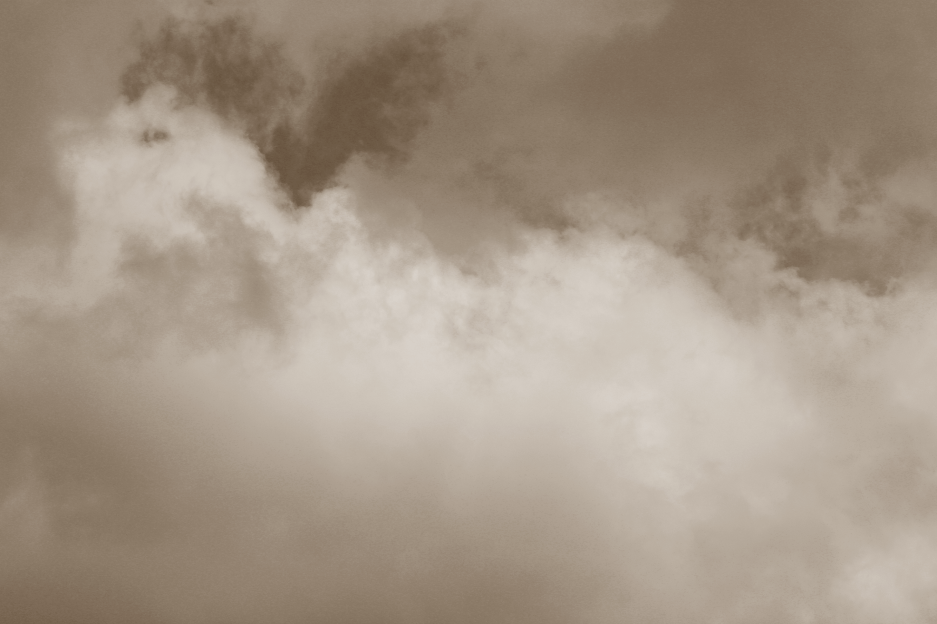
Repetition

Emphasis – scale

contrast color

Emphasis – color

symmetrical

proximity
The strengths that I see in my own work are my creativity when selecting my pictures. The weaknesses I see in my own work are the quality of my photos and my lack of proper selection in my chosen photos. The ways that I might improve or refine my approach in future photography projects is by taking more pictures even if they are not the best choice of picture at the time. I could also improve the quality of photos that I take, and learn how to better photoshop the pictures to be more clear. The photo I chose is the picture of Repetition, and the emotions or messages that I intended to convey through this photograph are the concept of light vs dark, or good vs evil. this is shown in the image because of the brighter white in a cloud, surrounded by much more of the darkness in the clouds. which means while there are more evil acts than good acts, it is all in the eye of the person looking at it, because it could be considered the inverse. The specific principle of design that I would like to explore further in my photography is contrast color. This is because it allows two or more completely opposite colors to be near each other, but both share the spotlight in the picture. The concept or technique that I want to experiment with in my next project is Skew pictures. This is something that I only used once and it looks comparatively cooler to traditional photos that I have taken in the past, I think that they work very well for action shots, once I learn how to increase the quality of the photos.
The two photos that I liked best were the Contrast Color and the Symmetry picture. The symmetry picture was pleasing to the eye because it had patterns and repetition. The contrast color was a great shoot because the two boys in the picture coincidentally wearing different colors. I believe that the tonal photo could be better because I cannot really see the principle that is being used. The movement photo uses the composition technique to FILL THE FRAME.
Your tonal and movement photos were definitely your best both of these have a great sense of scale and FRAMING with natural lines. One photo I think you can do better on i symmetry. While the object is symmetrical the angle that you have it at makes the photo asymmetric. A fix for this would just be a different angle next time.
Your Contrast Color and Movement photos, in my opinion, were your best photos out of all of your photos due to how you framed and scaled it. However, I think that you can improve your symmetry photo. With the angle you chose, it made the photo asymmetrical. If you have chosen a different angle, your photo would improve.
The Isolation and Repetition photos were my favorite. They were very pleased to look at the nature in them. If I feel like the symmetrical one could have been better. If it was taken at a different angle it would have been symmetrical. The Pattern photo had the PATTERN AND REPETITION composition technique in it.