LEGO POSTER

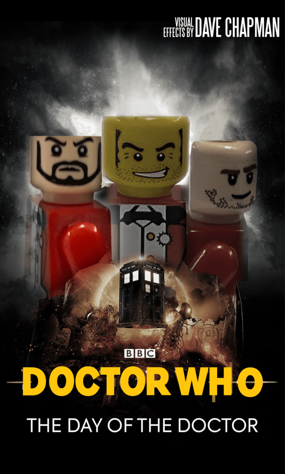
  I choose this photo to recreate because it had lots of cool color accents that would be cool to mess around with. I like how I was able to blend the lego guys with the foreground of the original image, and after changing the image to black and white, the foreground kept a little … [Read more…]

Liquid Death

This was an old-school coke ad, I replaced the coke that was in the picture, with cans of Liquid Death. In this I used used, shape, value, form, and color as the Elements of Art. In order to make this I used the Clone Stamp, Paint Brush, Eyedropper, Pen tool, and Spot Healing Brush. This … [Read more…]

c 4 k

What I did for this was I made an old school beach scene with a sun rise. The elements of art or principles of art most prominent in my image are color and shape.  I used the pen tool, the gradient tool, the rectangle tool, and the eclipse tool. To make the trees, I used … [Read more…]

Halloween Horrors

The biggest challenge that I encountered during this assignment was the insertion of the cliff in the picture of Fear of Heights because I was not able to take a picture of it or anything like it. I had a basis of what I wanted it to look like, based on images I saw while … [Read more…]

My Design Principal Pictures

unity symmetrical       The strengths that I see in my own work are my creativity when selecting my pictures. The weaknesses I see in my own work are the quality of my photos and my lack of proper selection in my chosen photos. The ways that I might improve or refine my approach in … [Read more…]

Biomes

I think that line, proximity, space, and space are most prominent in my image. I used the pen tool, rectangle tool, drop shadow effect, and the direct selection tool to make this picture. My goals in making this image were to learn more about how to use adobe illustrator and the tools in it. I … [Read more…]

Swiss Cheese

 My favorite color properties group that I used for this project was the Cool colors, just because of how cool they look when it is against the white background.  The most difficult part of the tutorial for me was creating the different images with the colors. I like my final images because they are unique … [Read more…]

Company Logo

  The type of business I designed my logo for is a metalworking company. To be honest, I came up with the idea for this on the way to a retreat, so I could have come up with a better idea. But I am happy with the execution of it. The logo represents my business … [Read more…]